TYPEFACE
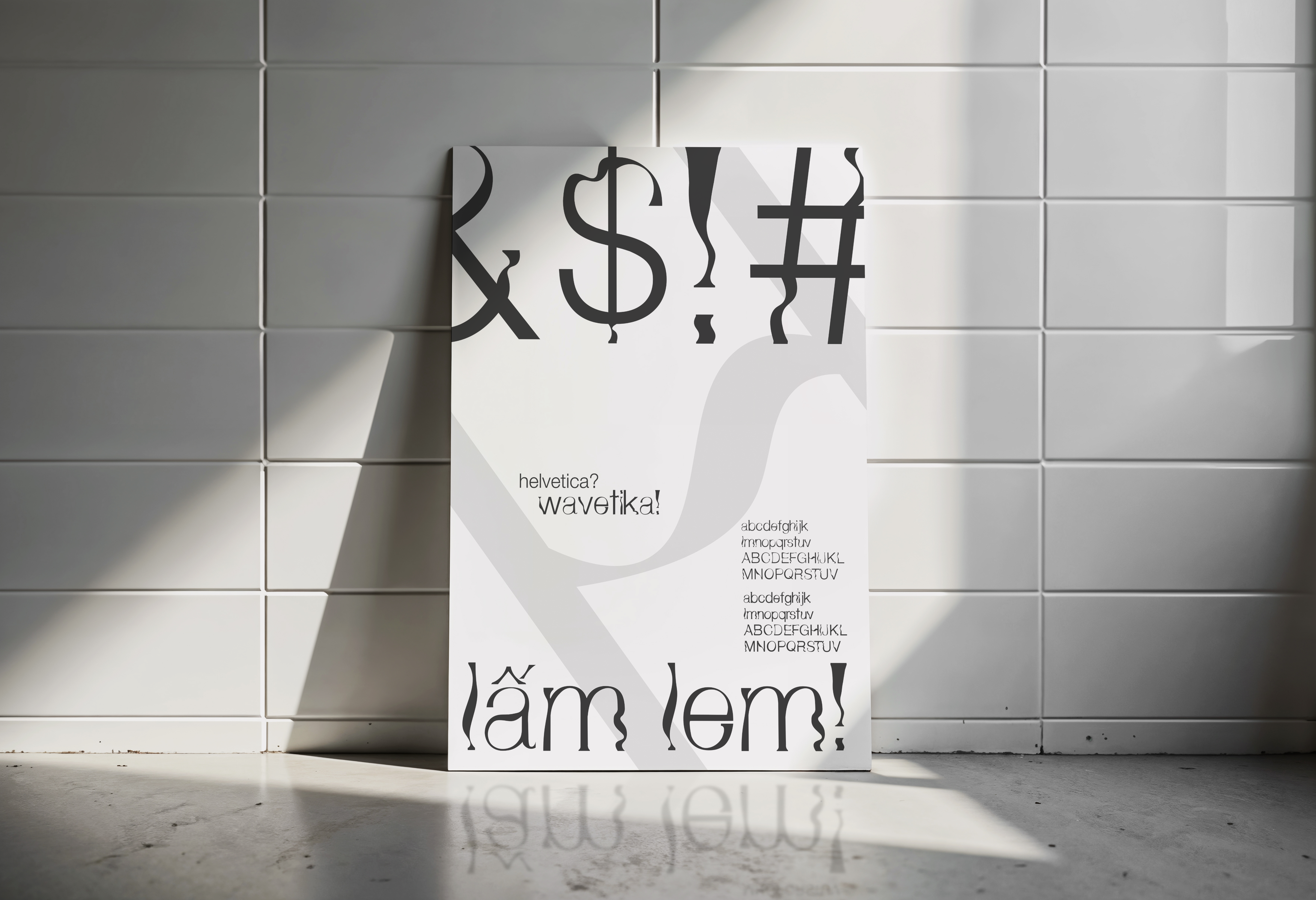
WAVETIKA
New typeface based on Helvetica.
Brief
Helvetica is celebrated for its straight strokes and universal usability. This project serves as a typographic "what-if" experiment. I wanted to challenge myself to deconstruct this iconic typeface and reimagine it through a more expressive, fluid lens, turning a strictly functional font into something much more decorative and playful.
Solution
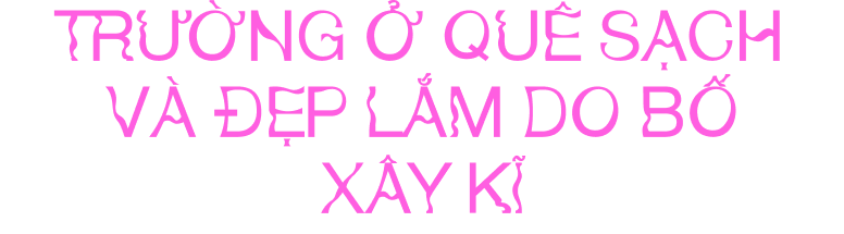
I developed Wavetika by meticulously modifying Helvetica, preserving enough of its original structure for legibility while introducing subtle, flowing curves that mimic the behavior of water. This transformation shifts the font’s purpose from functional body text to a display typeface suited for liquid-themed visuals and refreshing product identities.
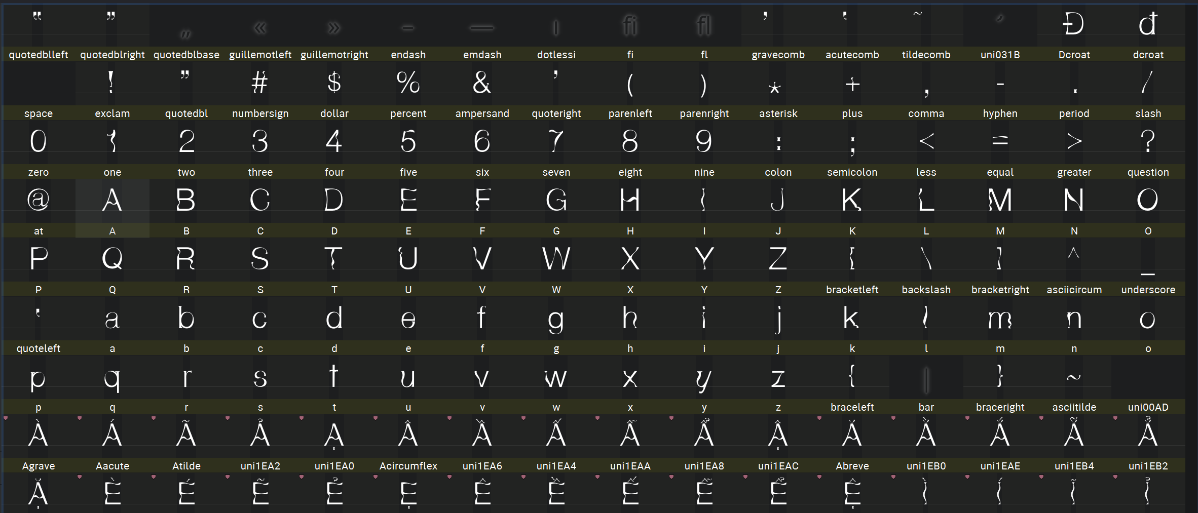
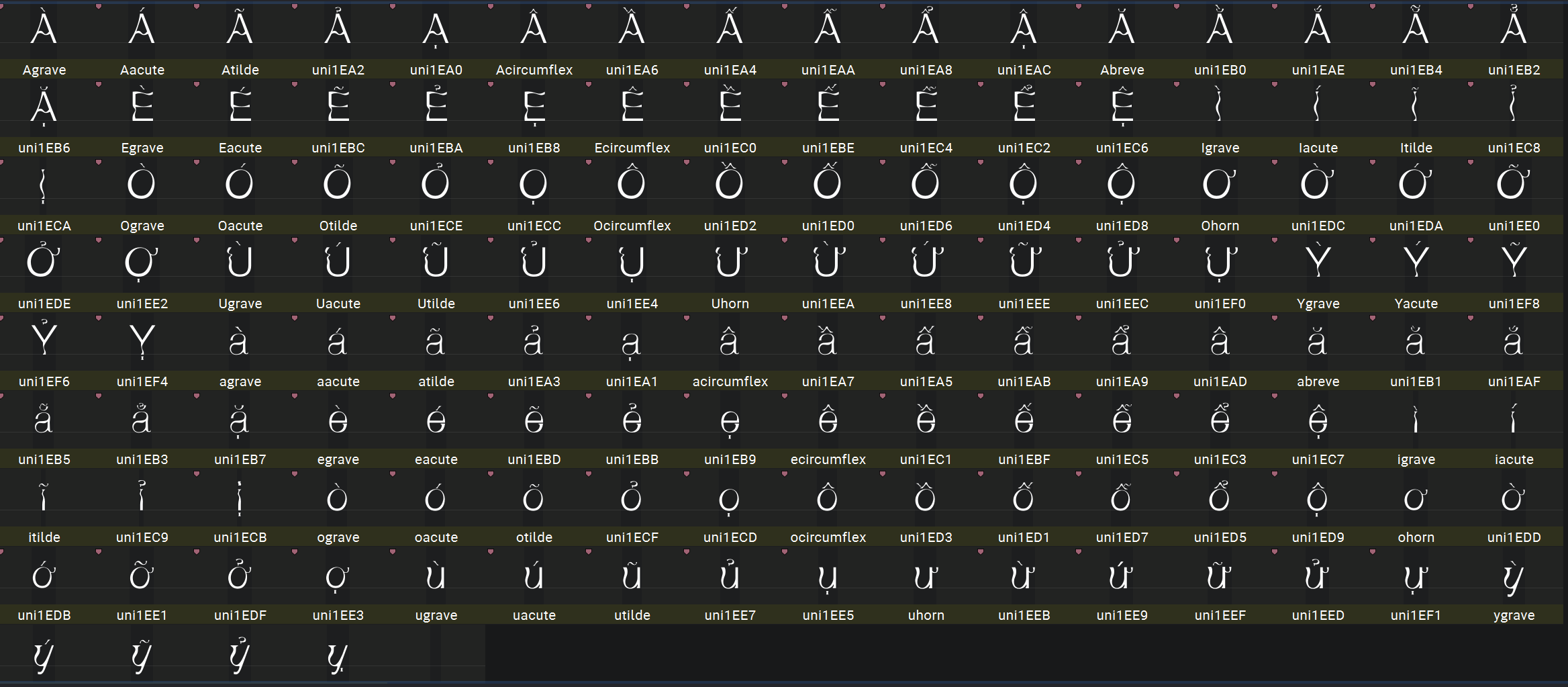
As a technical milestone, I expanded the family to include the full Vietnamese alphabet.
-->
SCROLL DOWN FOR MORE
-->


(+84) 373 018 990
hoangtuongvy.work@gmail.com
TYPEFACE
WAVETIKA
New typeface based on Helvetica.
Brief
Helvetica is celebrated for its straight strokes and universal usability. This project serves as a typographic "what-if" experiment. I wanted to challenge myself to deconstruct this iconic typeface and reimagine it through a more expressive, fluid lens, turning a strictly functional font into something much more decorative and playful.
Solution
I developed Wavetika by meticulously modifying Helvetica, preserving enough of its original structure for legibility while introducing subtle, flowing curves that mimic the behavior of water. This transformation shifts the font’s purpose from functional body text to a display typeface suited for liquid-themed visuals and refreshing product identities.
As a technical milestone, I expanded the family to include the full Vietnamese alphabet.
-->
SCROLL DOWN FOR MORE
-->
(+84) 373 018 990
hoangtuongvy.work@gmail.com

Menu
Menu


TYPEFACE
WAVETIKA
Brief
Helvetica is celebrated for its straight strokes and universal usability. This project serves as a typographic "what-if" experiment. I wanted to challenge myself to deconstruct this iconic typeface and reimagine it through a more expressive, fluid lens, turning a strictly functional font into something much more decorative and playful.
Solution
I developed Wavetika by meticulously modifying Helvetica, preserving enough of its original structure for legibility while introducing subtle, flowing curves that mimic the behavior of water. This transformation shifts the font’s purpose from functional body text to a display typeface suited for liquid-themed visuals and refreshing product identities.
As a technical milestone, I expanded the family to include the full Vietnamese alphabet.
SROLL DOWN TO SEE MORE


The alphabet supports Vietnamese accent marks.