Rebranding: Tien Dung Cake
New logos, new packages, new brand guidelines for a very old traditional cake.
Brief
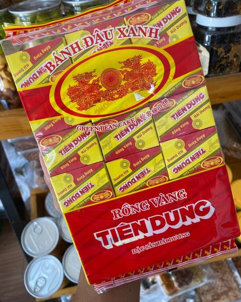
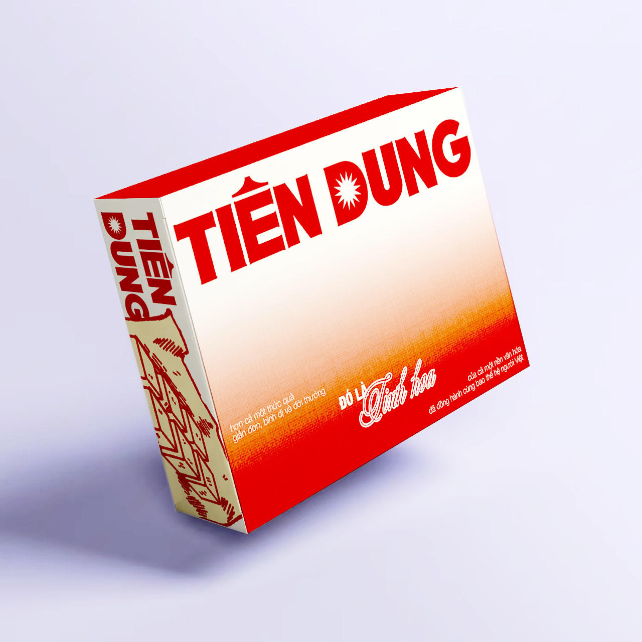
Tien Dung mung bean cake is one of Vietnam's traditional cakes. It has a sweet and rich flavor and represents a bygone way of life. However, because it's a traditional cake, its brand identity has become outdated. With my love for mung bean cakes, I've tried to rebrand this type of cake.
Solution
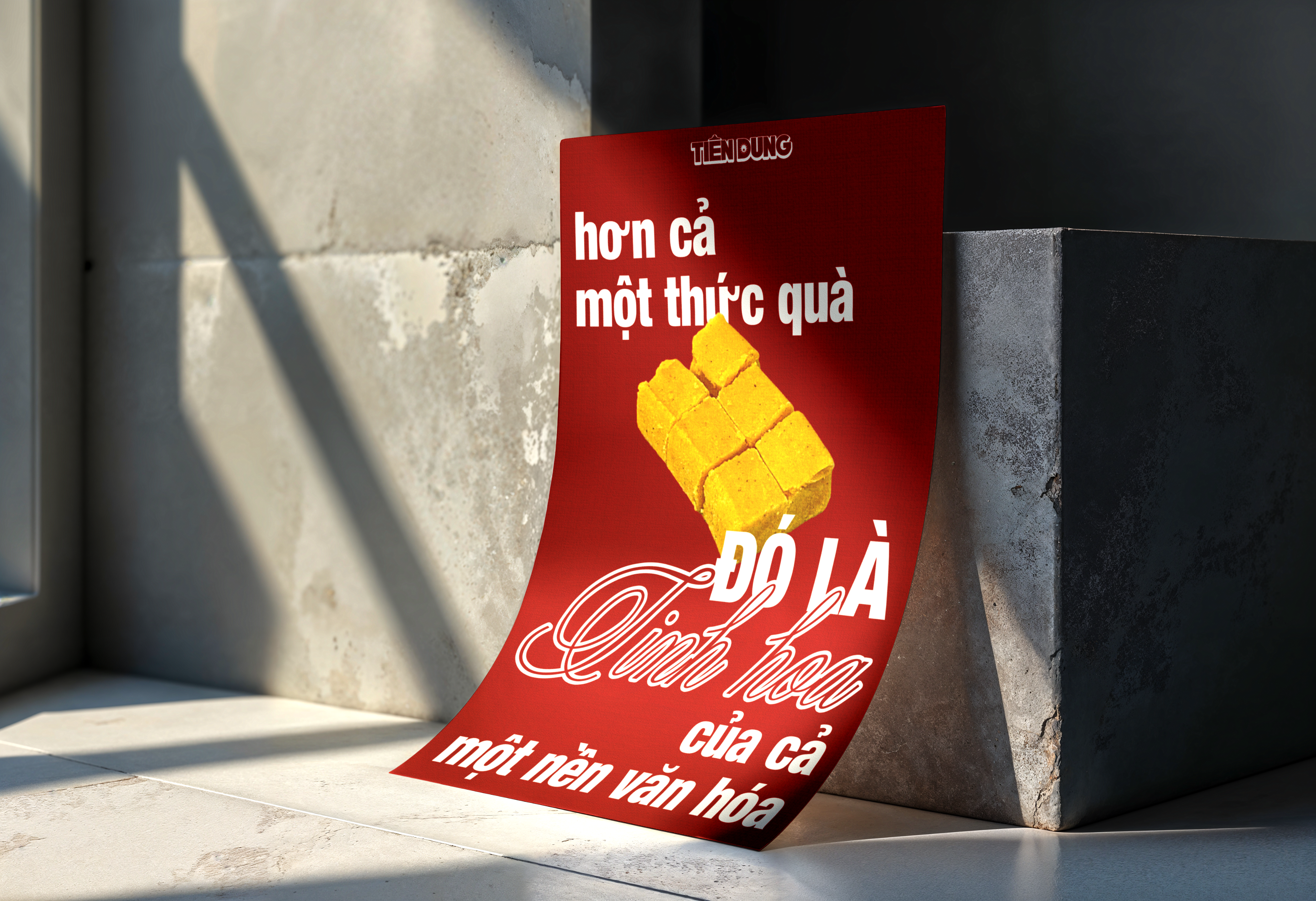
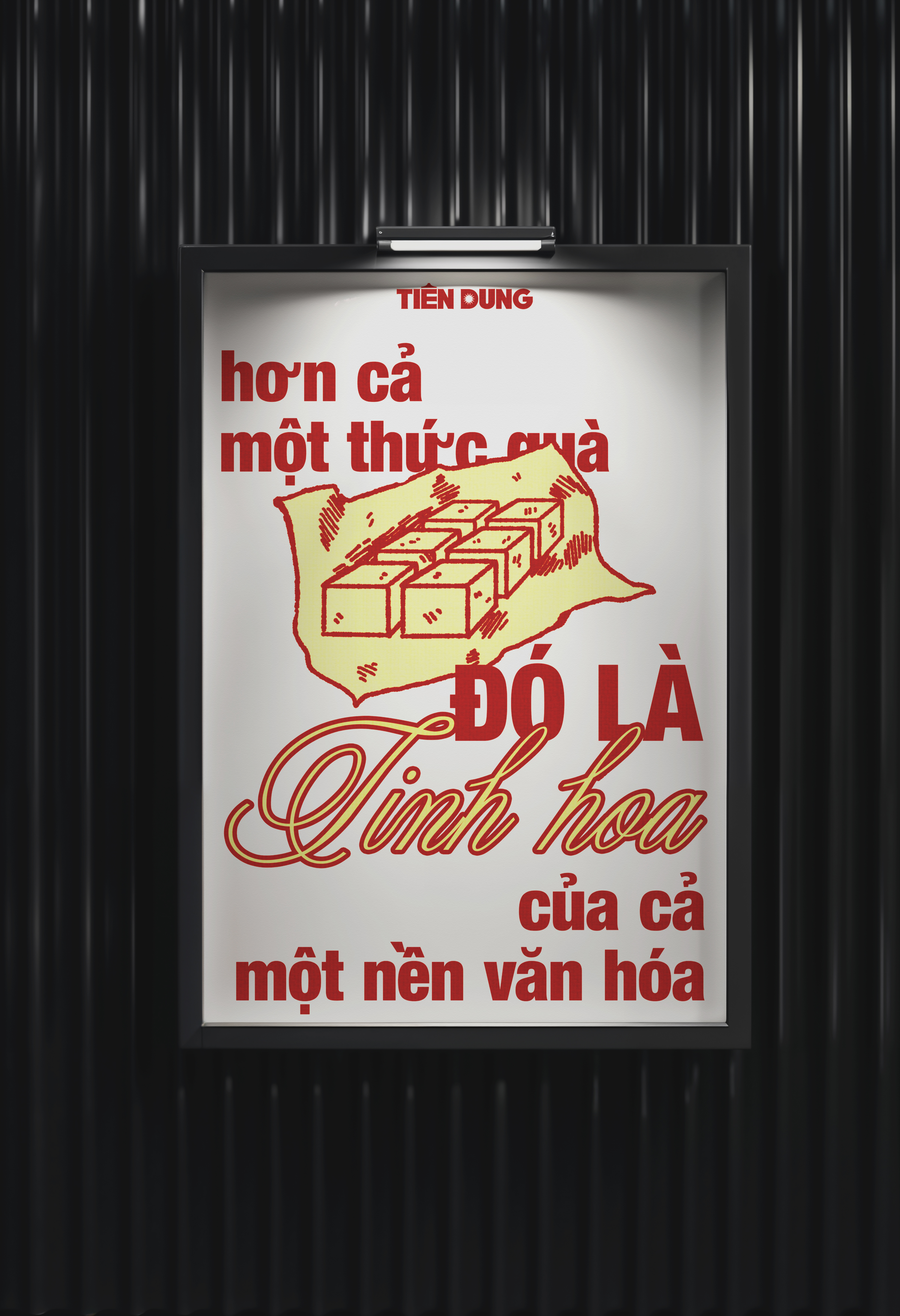
In this project, my goal was to retain the characteristics of the old brand: bold, sans-serif fonts with an Asian feel. However, I also wanted to make the brand image more youthful and accessible to users, so I made some changes in the visual presentation.
-->
SCROLL DOWN FOR MORE
-->
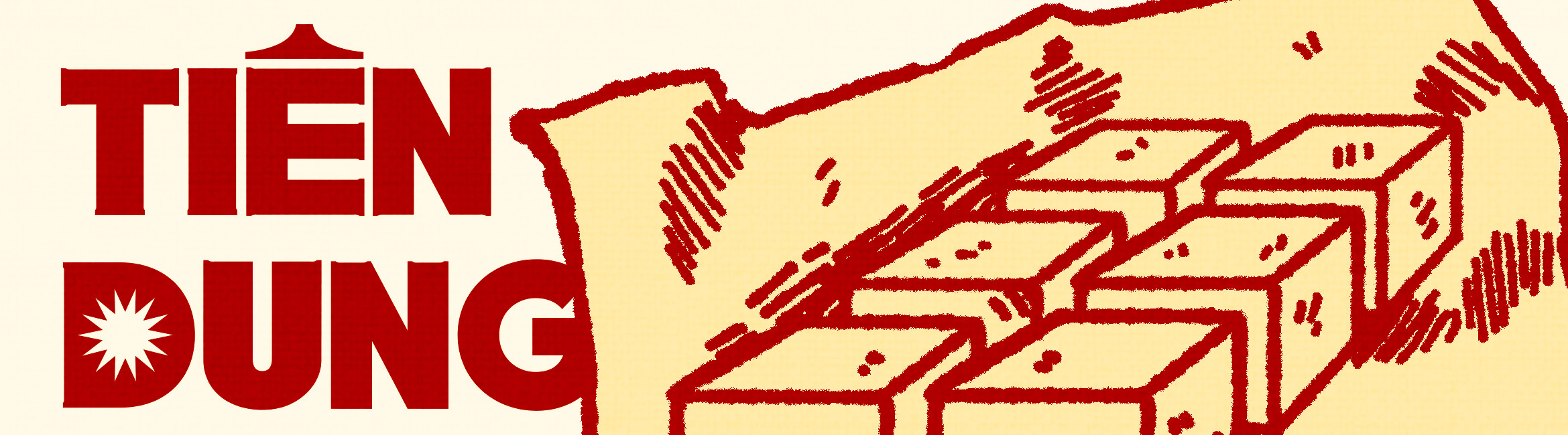
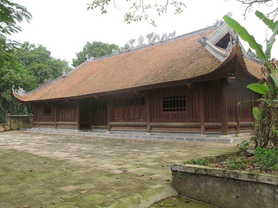
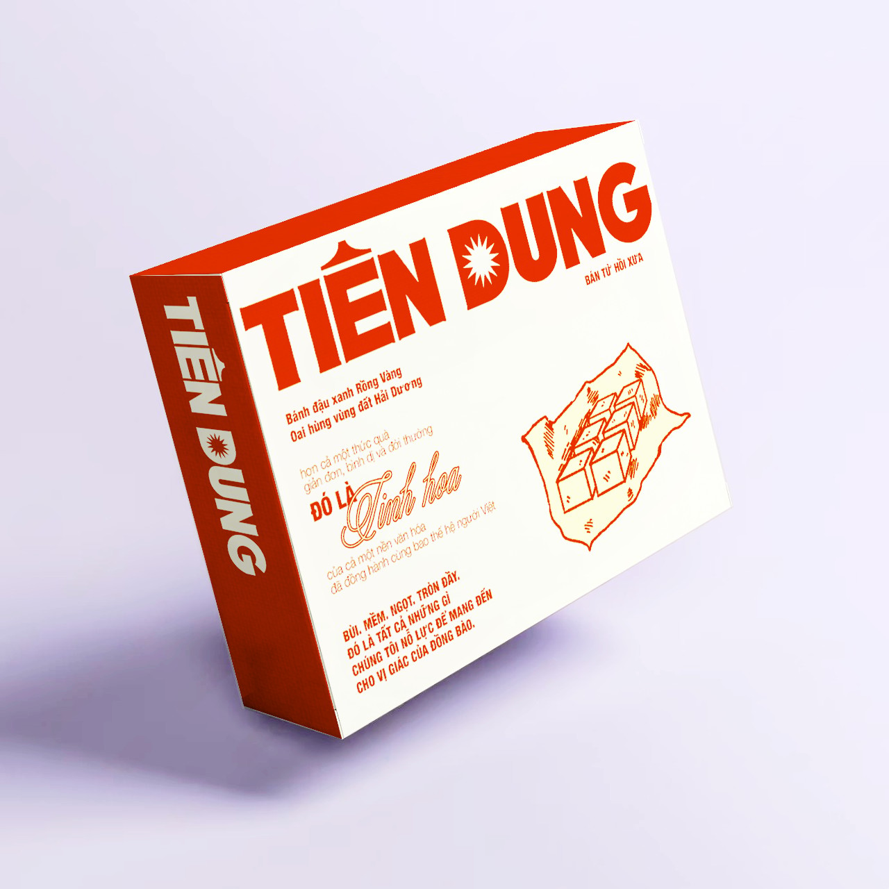
The hat of letter E are inspired by the roof of tradiontal Vietnamese houses.
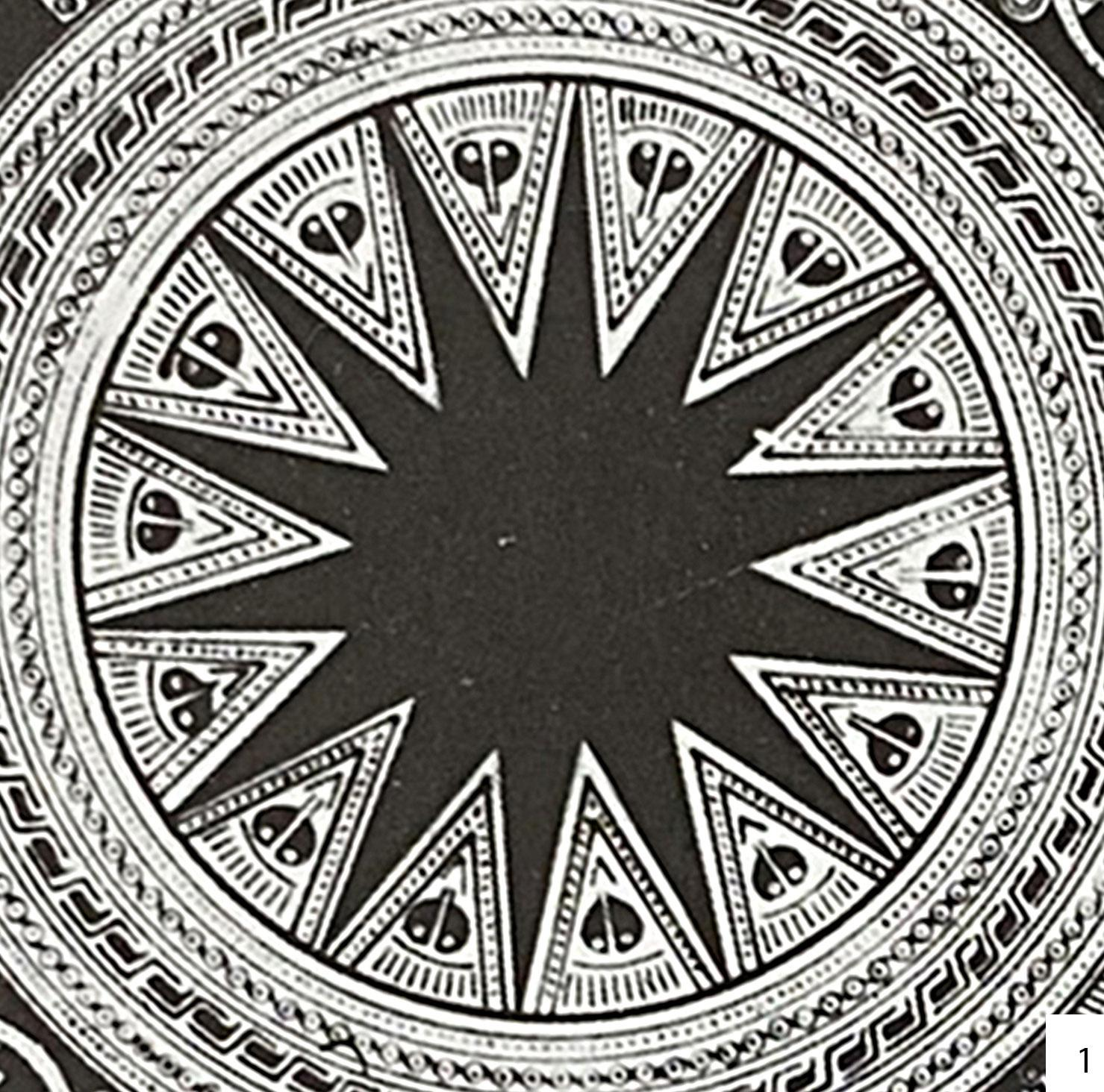
Based on the Trong Dong, I recreated letter D

(+84) 373 018 990
hoangtuongvy.work@gmail.com
Rebranding
Tien Dung Cake
New logos, new packages, new brand guidelines for a very old traditional cake.
Brief
Tien Dung mung bean cake is one of Vietnam's traditional cakes. It has a sweet and rich flavor and represents a bygone way of life. However, because it's a traditional cake, its brand identity has become outdated. With my love for mung bean cakes, I've tried to rebrand this type of cake.
Solution
In this project, my goal was to retain the characteristics of the old brand: bold, sans-serif fonts with an Asian feel. However, I also wanted to make the brand image more youthful and accessible to users, so I made some changes in the visual presentation.
-->
SCROLL DOWN FOR MORE
-->
The hat of letter E are inspired by the roof of tradiontal Vietnamese houses.
Based on the Trong Dong, I recreated letter D
(+84) 373 018 990
hoangtuongvy.work@gmail.com

Menu
Menu


BRAND IDENTITY
TIÊN DUNG
Brief
Tien Dung mung bean cake is one of Vietnam's traditional cakes. It has a sweet and rich flavor and represents a bygone way of life. However, because it's a traditional cake, its brand identity has become outdated. With my love for mung bean cakes, I've tried to rebrand this type of cake.
Solution
In this project, my goal was to retain the characteristics of the old brand: bold, sans-serif fonts with an Asian feel. However, I also wanted to make the brand image more youthful and accessible to users, so I made some changes in the visual presentation.
SROLL DOWN TO SEE MORE

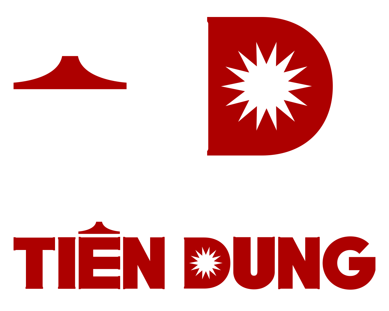
The hat of letter E are inspired by the roof of tradiontal Vietnamese houses.
Based on the Trong Dong, I recreated letter D
Keeping the original logo.